This blog post was later published by the Burnaby Beacon.
Burnaby is growing into itself. We are thriving in many ways, while building a unique identity. This was even the topic of a panel led by the Burnaby Beacon last month. Our city’s diverse communities, food, and expression is evident, but one area where we miss the mark is public art.
Many cities, even our sister Vancouver, have a leg up on us; colourful murals, pop-up displays, and sculptures which make us contemplate. Stuff like this gives public space character.
My neighbourhood, Metrotown, has rapidly developed in the last decade. And although some beautiful towers and walkable paths have been built, the art has lagged behind big time. The only way I can describe Metrotown’s art is a hot mess, tbh.
GREY MADE GREYER
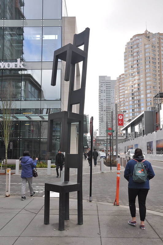
When the new Station Square was built, I was baffled by the developers’ art choices. Some examples include:
- Dark metallic statues next to the bus loop. These only deepen the greyness of our already grey and rainy town. The lack of contrast with the concrete give me dystopian vibes.
- The stack of bronze chairs on Silver Drive. Just… ??????
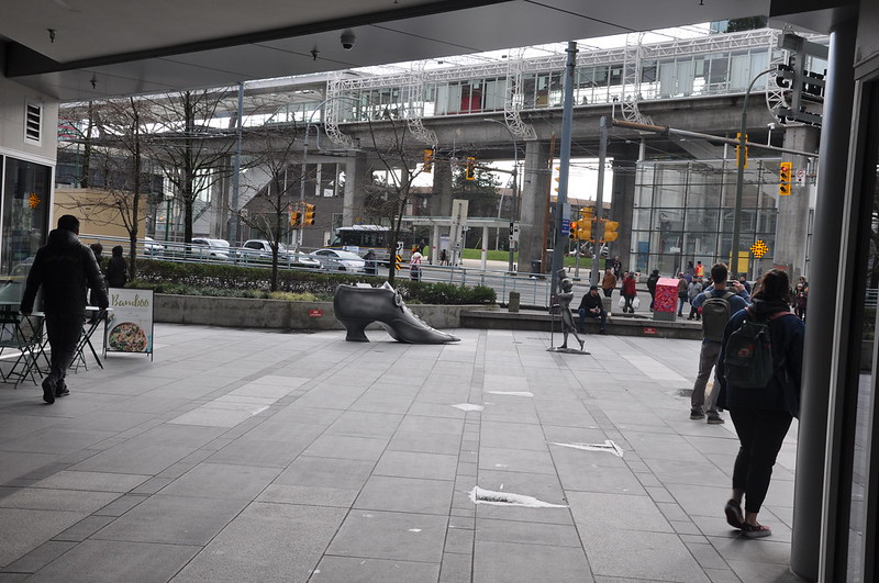
- RED PHONE BOOTHS!? I can totally see them sitting at the boardroom table saying, “Yeah, let’s drop in a couple boring colonial symbols. And sure, right outside the Asian grocery store we are also building.” So out of place.
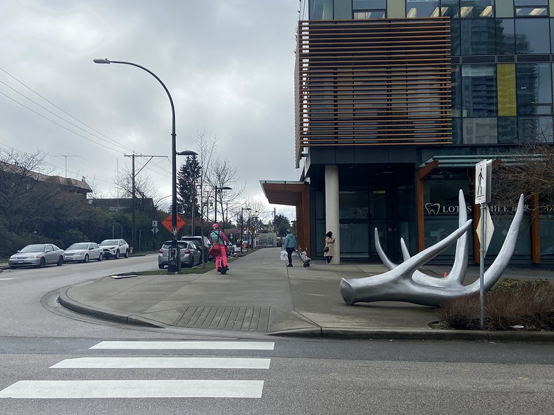
TransLink fumbled the opportunity to liven up the new Metrotown SkyTrain station, too. Although some community-sourced art was added to the bike locker last year, the station is still pretty bland, despite being a focal point of the neighbourhood. Take a few steps behind the station, and you’ll stumble upon arguably my least favourite art in the area: a solid coloured log-shaped bench. Choices.
SO MANY BLANK WALLS
Metrotown could definitely take inspiration from areas like Main Street, where they hold mural exhibitions. I admire the art every time I bus through, thinking about the meaning of the giant paintings on the back of brick buildings. Some may say it isn’t worth painting murals in Burnaby because many of our buildings are being demolished soon. To that I say, paint them on new buildings! See what they’ve done downtown in the core of the business district.
BURNABY’S VISUAL IDENTITY MUST INCLUDE INDIGENOUS PEOPLE
We are on stolen land. This is a concept more and more settlers in Burnaby have begun to understand. We cannot separate their culture, stories, and art from the built environment.
When you think of Vancouver murals, you most likely think of Coast Salish art. To me, it is part of Vancouver’s visual identity, especially in recent decades as the city makes space for Indigenous self-expression. Not nearly enough space, but still.
Public art policies play a role in community resilience, even moreso during lockdown. When outside was the only place we could go, the streets were transformed in many municipalities to be more colourful and pedestrian-friendly. As we come out of this pandemic, I believe Burnaby and private developers have the perspective and tools to make room for more Indigenous representation in public art.
If more public art in Metrotown is explicitly Indigenous, then the built environment will better reflect the traditional history of the land. This idea was presented in one of my final group projects in University, focusing on Abbotsford. We proposed an urban planning policy that highlights the intersection of reconciliation and health through public art.
Lack of Indigenous representation and mental health support are two inequalities that can negatively affect the Abbotsford community or hold the community back from realizing its potential. Moving towards a post-COVID-19 landscape, we believe cities must think critically about the role of policy in addressing key social issues.
“Cultural Diversity in Abbotsford Through Public Art” Policy Brief – Special Topics in Sustainable Development SD499 Pandemics and Cities: Planning for More Resilient and Sustainable Communities” (2020)
This policy brief has a lot of cool research and concepts which could be applied to any growing city, like Burnaby’s Metrotown. Check it out in the link above for more great examples of how other cities have implemented participatory Indigenous art.
Now do you see why I get the ick from Station Square’s red phone booths?
What is being done well
Clearly visible from Main Street SkyTrain station is one of my favourite murals in Vancouver. It is a great example of the intersection between art and housing justice. A disproportionate amount of the Lower Mainland’s Indigenous peoples are houseless, so this mural brings a sense of resilience to the building.
Some great benefits to Indigenous art in Metrotown: Learning opportunities for nearby schools! Compensation for marginalized folks! Puncturing a capitalist landscape with beauty!
I want to note that I am a white settler, so when I write about Indigenous topics I include resources where their perspectives are voiced. Check out the video linked later on, and feel free to peruse my other blog posts for more external materials.
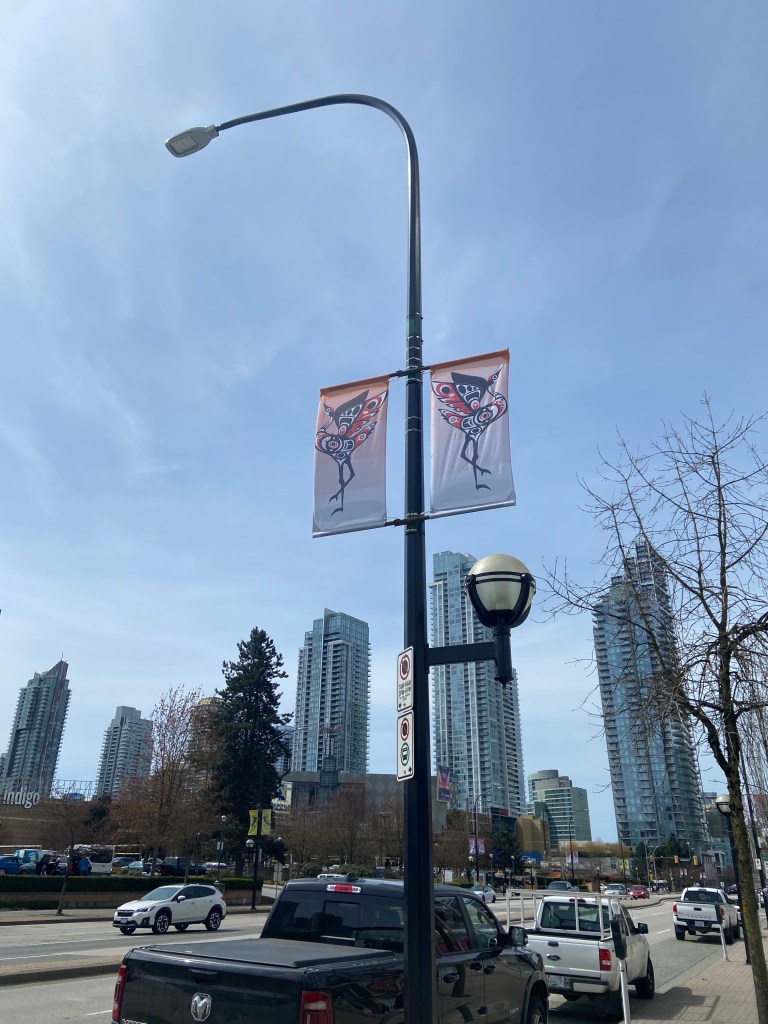
SUSSEX BY TOWNLINE
A couple years ago, I was walking up the block from my house and saw some metal panels going up on the front of Townline’s new development, Sussex. Seeing Coast Salish art on my block was first surprising, and then made me sceptical.
Why? There is so little Indigenous art here, that it was totally possible to me that the developers haphazardly hired a settler artist to make it. That they were trying to fit in with the “trend” of reconciliation, rather than doing the proper work.
So, I sent them an email.
Within a day, I received a kind phone call from the developers, who explained to me that a press release would be published at the end of 2021 about this art, and assured me that it was created by an Indigenous artist. They said they worked with the artist, an art curator, and other stakeholders to create the piece, now we know it is called “Rise and Fall”. They also used phrases like “proper process” and “respecting the artist”, but that they couldn’t share many other details.
This was a good sign, but I awaited the promised press release.
Almost a year after my initial email, I received a letter back from the developers. They thanked me for my inquiry once again, and shared this video:
This is so cool! I expected a one-pager posted ten layers deep on their website, not a fully-produced video. I hope lots of people get to see this, and go to The Sussex to see and read about “Rise and Fall”. The message behind Marianne Nicholson’s piece is moving and poignant, and is a perfect example of Metrotown’s potential.
On the note of colour, the church attached to Sussex has rainbow glass panes jetting out from the walls. Tasteful but punchy additions of colour like this compliment the white and grey colours of the development well, and Nicholson’s metal art.
Metrotown is a blank canvas. There are so many new developments, with so many voids for community expression.

Nice piece Marina on the art appearing in Burnaby. I think that you would feel more comfortable with colorful murals and symbols of indigenous people.
The purpose of art is to create a response, to question ‘why’ and to have us take a minute to reflect as we scurry by and are gobbled up to the rows and rows of office towers.
LikeLiked by 1 person
Great piece on the Art in Burnaby. It will lift the spirits of passerby’s and stimulate thought.
I wonder if the sculptures will have an engraved message as to what it means to it’s creator.
I thought you are doubtful and not at ease with some works and would feel more comfortable with a colourful mural.
The purpose of art is to create a response. And, it looks like t
LikeLike